Inspiration
A repository of data-driven visual stories from around the world, humanising complex issues with design and technology.

Documentary
Dataviz
Comment la Russie et la Chine arment la junte militaire en Birmanie
La Russie et la Chine arment-elle le régime militaire en guerre contre sa population ? Deux ans et demi après le coup d’Etat, plus de 3 500 civils ont été tu...
Inspiration of the Week

Cinematic
Multimedia
The night chaos broke out: Little India riot, 10 years on
It started with a fatal traffic accident and erupted into Singapore's first riot since the 1960s. Here's what happened on the night of Dec 8, 2013.

Cinematic
AI Pin
Humane's device, called the Ai Pin, can take photos and send texts, uses a laser to project a visual interface onto a person's palm

Dataviz
Interactive
ARETE
The central result of the project is the interactive visualization of the history of the Latin alphabet.
Interactive
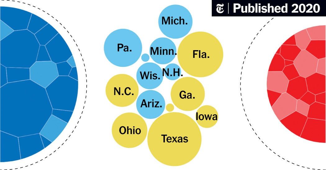
The Battleground States Biden and Trump Need to Win 270 (Published 2020)
In this interactive diagram, try building your own coalition of states to see potential outcomes of the presidential race.

Maps
‘A Beautiful Place That Has a Dragon’: Where Hurricane Risk Meets Booming Growth
The combined threat of climate change and development in risky areas is making it a big challenge to keep coastal Carolina residents safe.
Inspiration of the Week

Dataviz
ONE - Data Commons
Explore our data on the dynamic people and economies throughout Africa, and understand how the continent is evolving in a volatile world.
Inspiration of the Month
Illustration
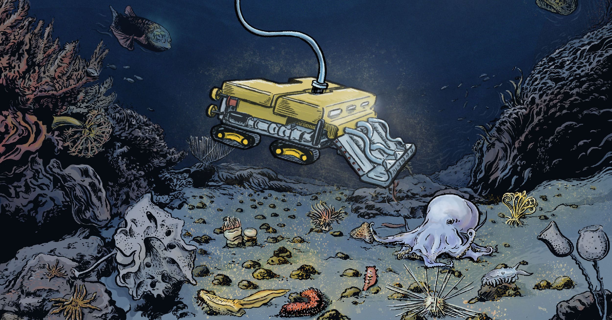
The promise and risks of deep-sea mining
A vast treasure of critical minerals lies on the ocean floor. Should they be extracted to help fight climate change?
Inspiration of the Week

Interactive
Retool State of AI Report 2023
What models, infra, and apps are devs using and loving? What are AI's real production use cases? Get insights on AI sentiment, adoption, and tooling in the report.

Maps
Spain lives in flats: why we have built our cities vertically
The development of cities in Spain has been upwards. Map of the evolution of urban planning in Spain, with data from the Cadastre — and why Spaniards live in apartments.

3D
On land, they waddle. Under water, they soar.
Here’s how Bird Paradise’s Penguin Cove was designed, to show penguins in all their glory – in and out of water.

Illustration
The history and revival of ancient Chinese hanfu: a visual guide | SCMP Graphics
Unravelling the fascinating world of Chinese traditional clothing, hanfu. From its rich history, exquisite designs, making and layering to how it differs from the Japanese kimono a...

Maps
The Missiles on Our Land
An investigation by the Princeton Program on Science & Global Security, Nuclear Princeton, and Columbia University’s School of Journalism, in partnership with Scientific American.

Maps
Beneath I-280
Excavating the Neighborhoods Lost to San José Freeways
Illustration
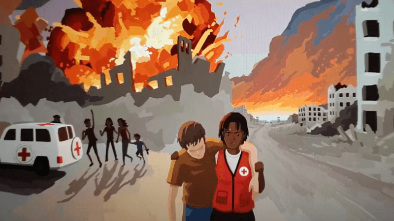
International Committee of the Red Cross - ICRC on LinkedIn: #icrc | 126 comments
In times of war, neutrality is not indifference; it is a deliberate way of working to be able to help without taking sides, allowing #ICRC to reach those who… | 126 comments on Lin...

Documentary
Interactive
The Quipu Project
272,000 women and 21,000 men were sterilised in the 90’s in Peru. Thousands have claimed this happened without their consent, but until now they have been repeatedly silenced and d...

Interactive
The China Ship, chapter 02
Second chapter of “The China Ship” the story of the Galleon of China as flagship of international trade over two centuries

Documentary
Hollow — an Interactive Documentary
Explore the rural communities of McDowell County, West Virginia through Hollow, an interactive documentary featuring the stories of over 30 residents who live there.
Inspiration of the Month

Multimedia
Britain’s shadowy border
A new army of drones, watchtowers and AI scours the UK coastline for small boats. But it didn’t stop migrants from dying
Dataviz
Maps
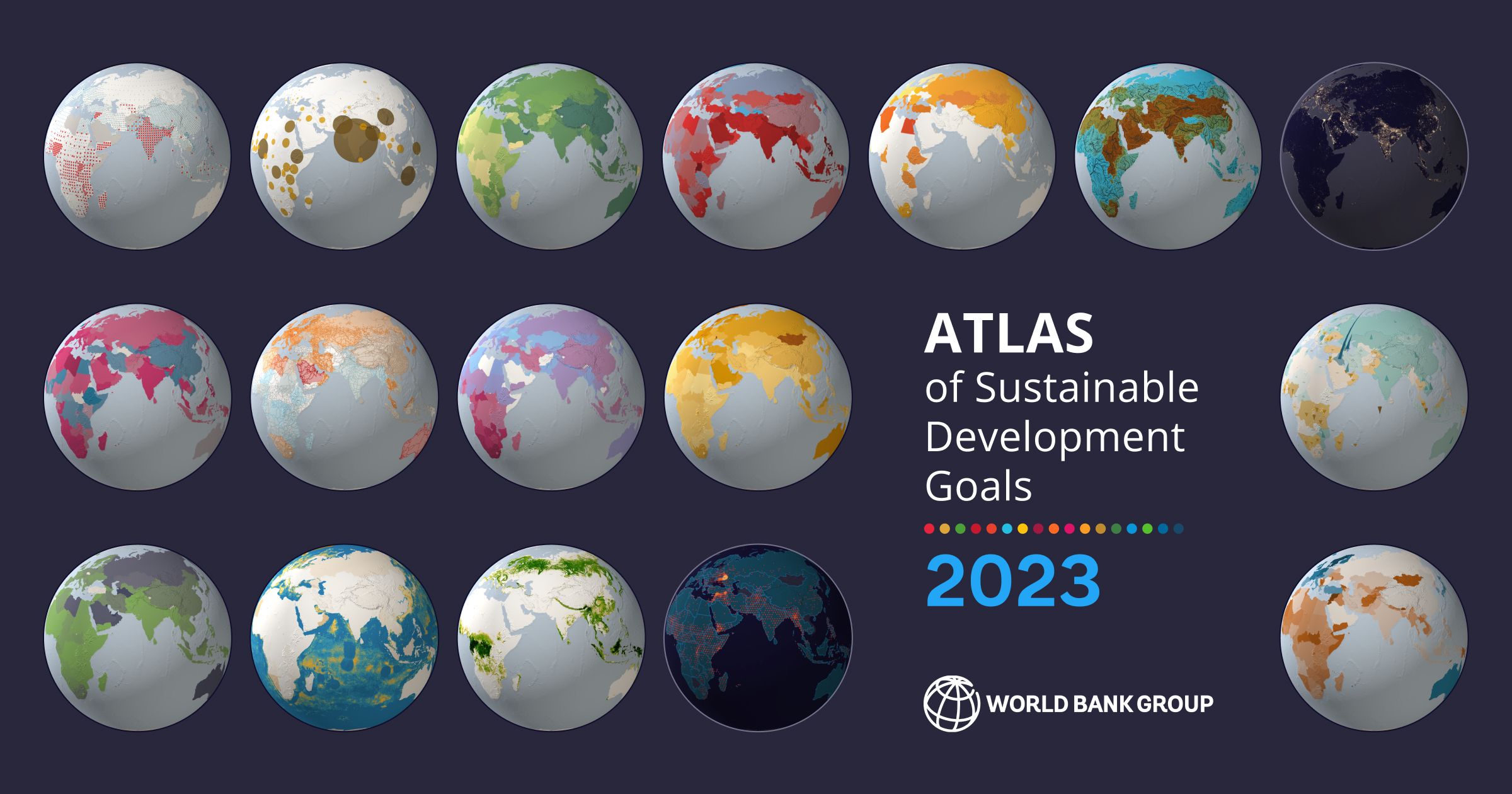
Atlas of Sustainable Development Goals 2023
The Atlas of Sustainable Development Goals 2023 presents interactive storytelling and data visualizations about the 17 Sustainable Development Goals. It highlights trends for selec...

Multimedia
The Night Raids
CIA-backed operations killed countless Afghan civilians, and the U.S. hasn't been held accountable. A reporter returns to investigate her past and unravel the legacy of the secreti...
Inspiration of the Week
Cinematic
Maps
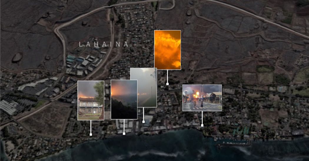
The Deadly Maui Inferno, Hour by Hour
The Times used video evidence, data and interviews to reconstruct the wildfire that raged through what was once Hawaii’s royal capital.
Illustration
Dataviz
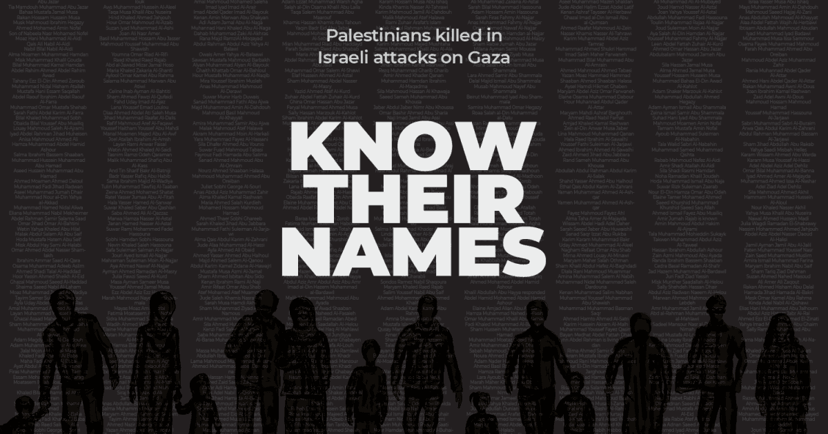
Know their names: Palestinians killed in Israeli attacks on Gaza
The thousands of Palestinians killed in Israeli attacks on Gaza.

Maps
An Extremely Detailed Map of New York City Neighborhoods
More than 37,000 New Yorkers told us where their neighborhoods start and end. We mapped them all.