Insights
Learnings and interviews on the making of visual investigations.
Research
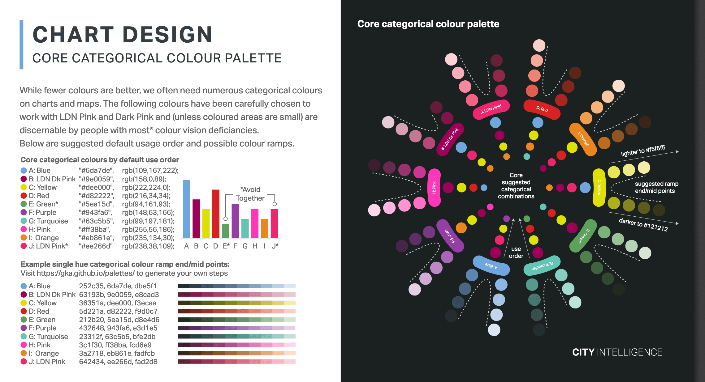
Data visualization style guides
Data visualization style guides are standards for formatting and designing representations of information, like charts, graphs, ta...
7 days
Data Viz Style Guides
Interviews
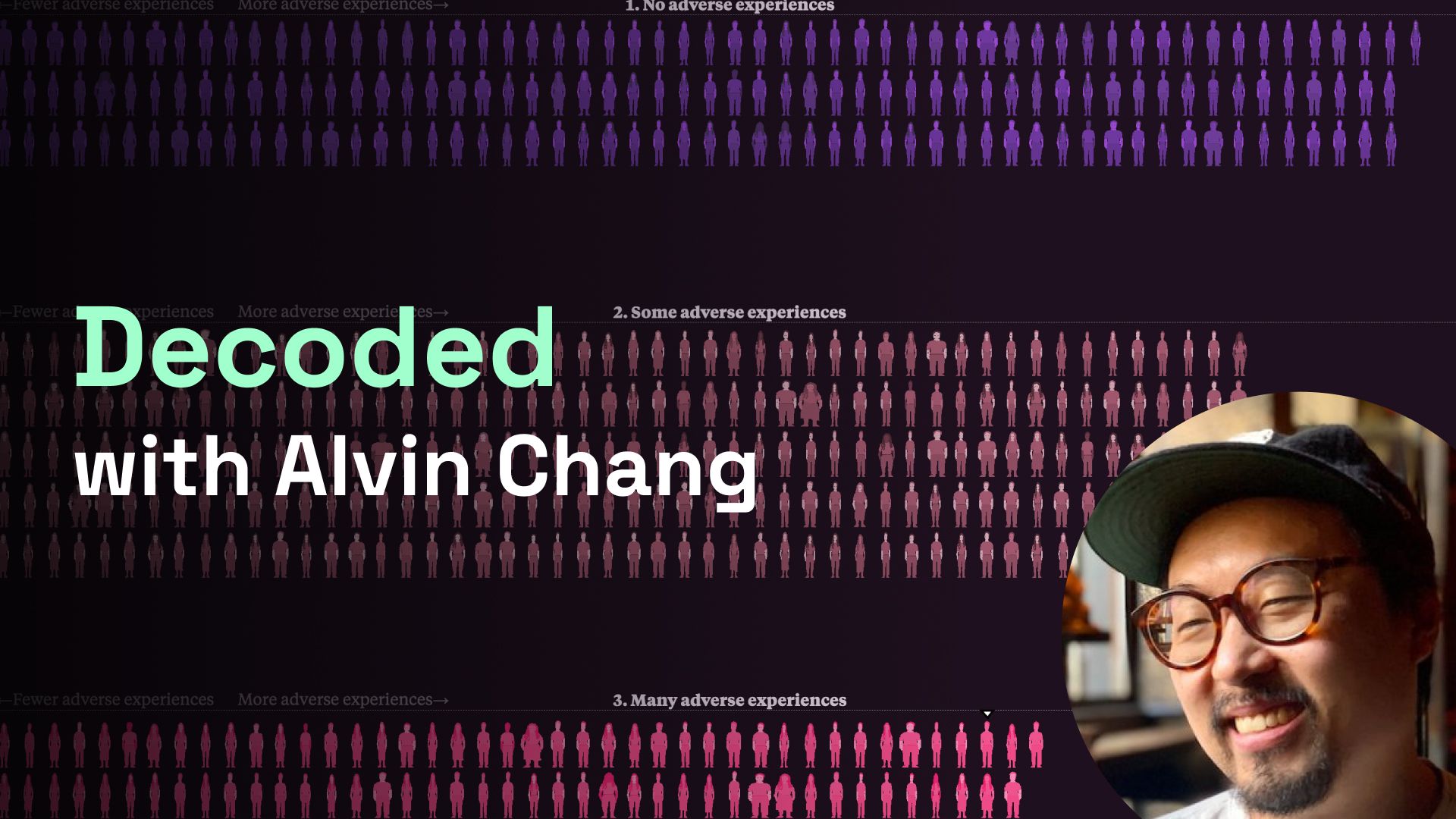
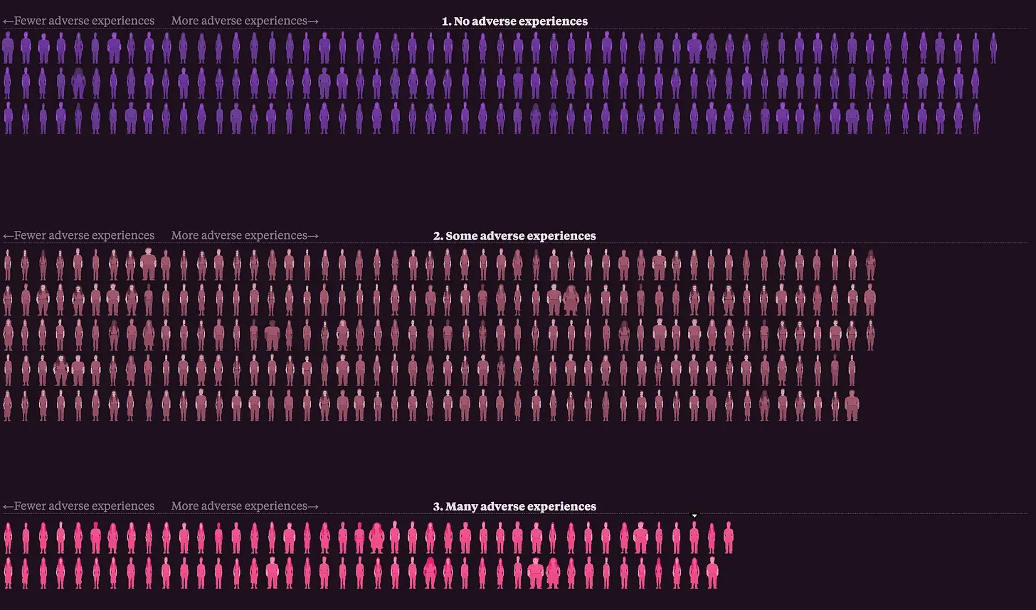
Decoded with Alvin Chang
Interview with Alvin Chang to learn about the making of his essay for the Pudding: This is a teenager. Watch to learn about P5.j...
3 months

How to
Making of my data essay for The Pudding
Case study on the making of my Pudding article about sleep training.
3 months

How to
Using Datawrapper to Make Custom Data Vi...
Using Datawrapper to Make Custom Data Visualization More Efficient
6 months
How to
Behind the scenes: This is a teenager
Keeping a daily diary of a big interactive data project
5 months

How to
Jacqui Banaszynski’s Six Paths to Story
In this workshop, Jacqui lists six paths a reporter can take to present information in a compelling fashion.
6 months
Interviews
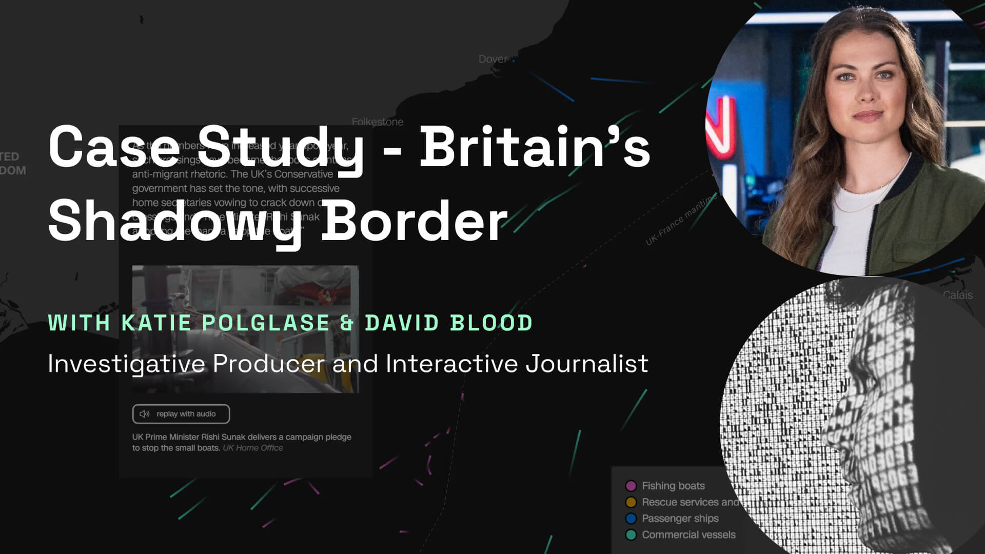
Case Study - Britain's Shadowy Border by...
In this case study, we looked at how David and Katie leverage OSINT and data journalism to investigate of tragic events involving ...
5 months

Interviews
Machine Learning in Data Visualization
An in-depth look at GPT’s Advanced Data Analysis feature with demos from Zhutian Chen.
7 months
Interviews
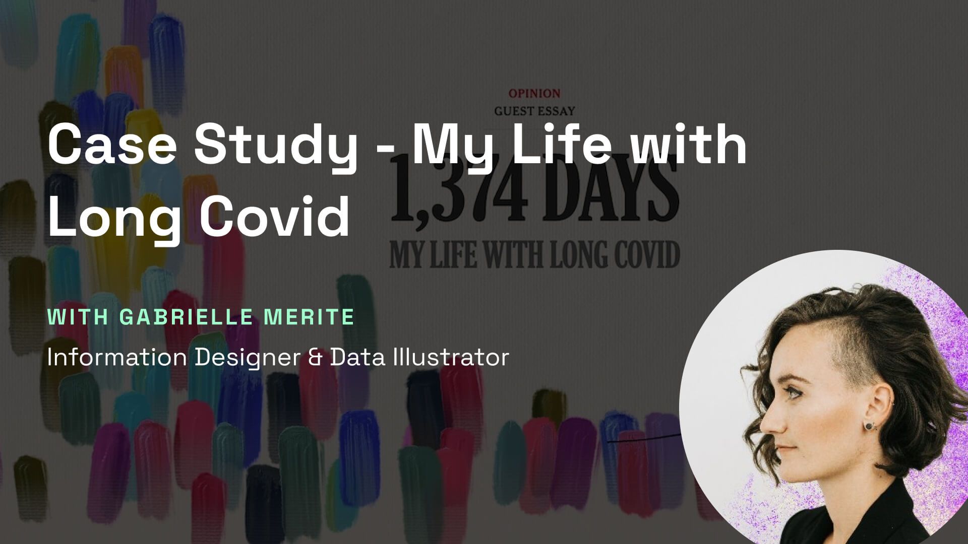
Case Study: My Life with Long Covid
In this case study Gabrielle discusses her creative process on the Pentagram and New York Times' opinion piece from Giorgia Lupi -...
5 months
How to
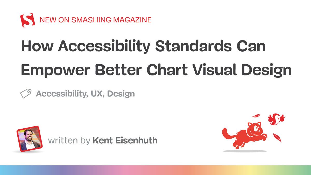
How Accessibility Standards Can Empower ...
Accessibility for data visualization extends well beyond web standards, at least if you’re trying to create an experience that’s a...
9 months
Interviews
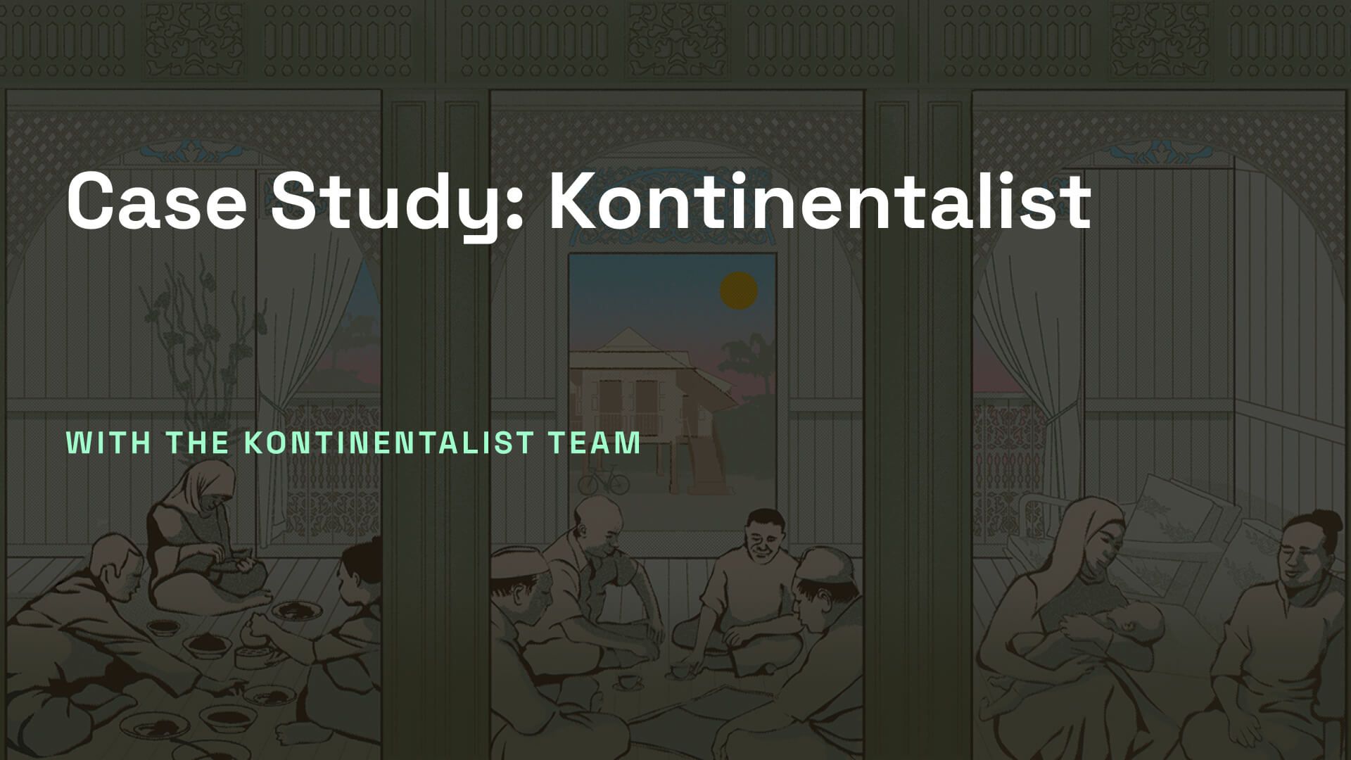
Case Study: Kontinentalist
Exploring the art of visual storytelling: A glimpse into Kontinentalist's innovative approach to crafting immersive narratives in ...
5 months

Interviews
XR Journalism with Tim Clark
Tim Clark, a creative director and product designer with a rich background in mixed reality (XR), shared his insights on the evolv...
5 months
How to
Bob Baker's Newsthinking
Tools to write stories with style
11 months
How to
How to Write a Good Story in 800 Words o...
Most of the good stories we tell can be told in 800 words or less. Let me try one.
11 months
How to
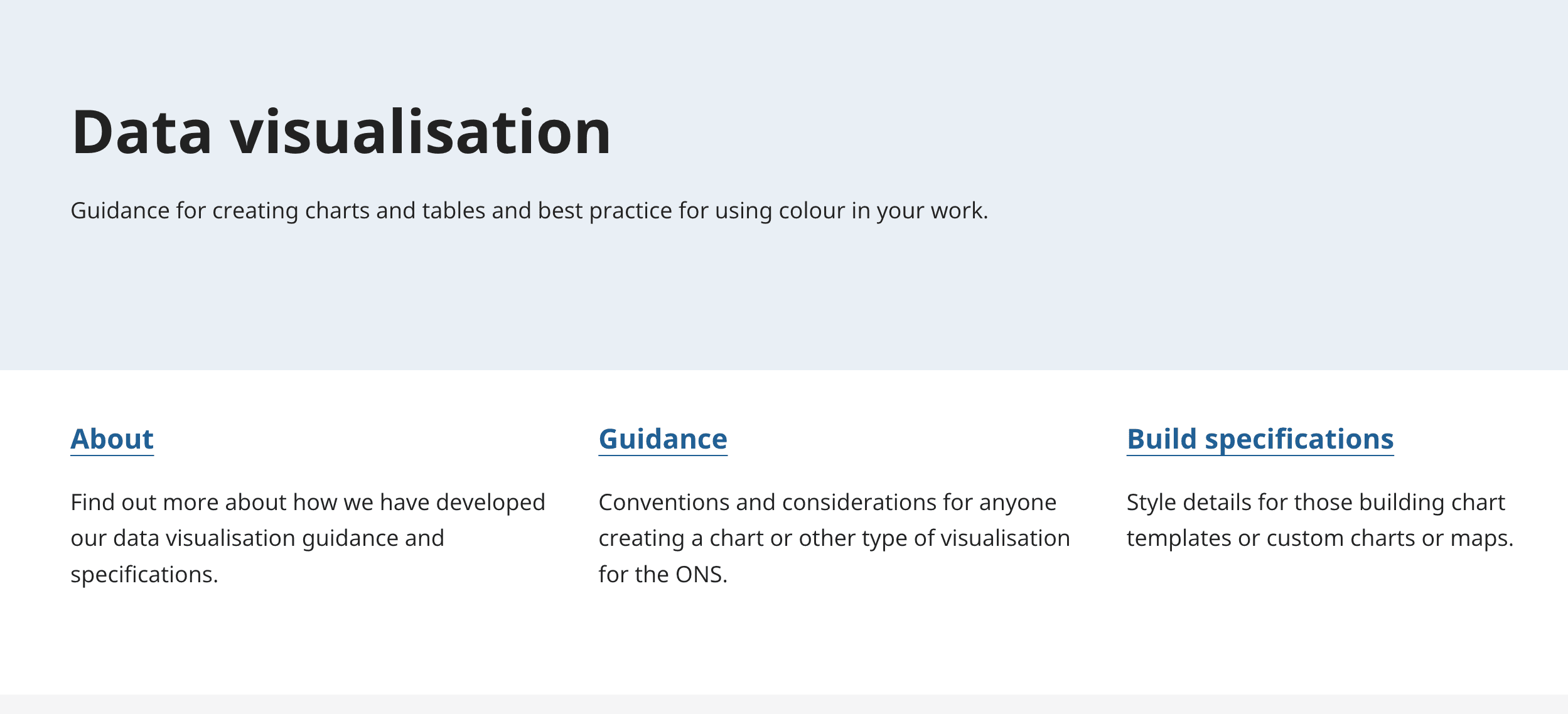
ONS - Service Manual
Our data visualisation guidance.
11 months

How to
Data Visualisation Guide
A Comprehensive Guide to Unlocking Your Data’s Potential
1 years
Data Europa EU

Interviews
Case Study: Sleepless in Singapore
Exploring the Technical and Creative Process Behind The Straits Times' Visual Data Story
5 months

How to
3D Data Visualization with React and Thr...
At the end of 2019, we had a hack week at Cortico where all of the technical staff got together to explore new ideas without any r...
1 years

How to
Mapbox Lighting, Shadows, and Fog
Exploring fog, shadow, and lighting configurations in Mapbox v3.
1 years
How to
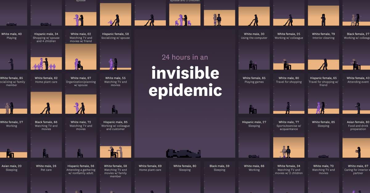
Behind the scenes with '24 hours in an i...
What we visualize when we visualize loneliness
1 years
Interviews
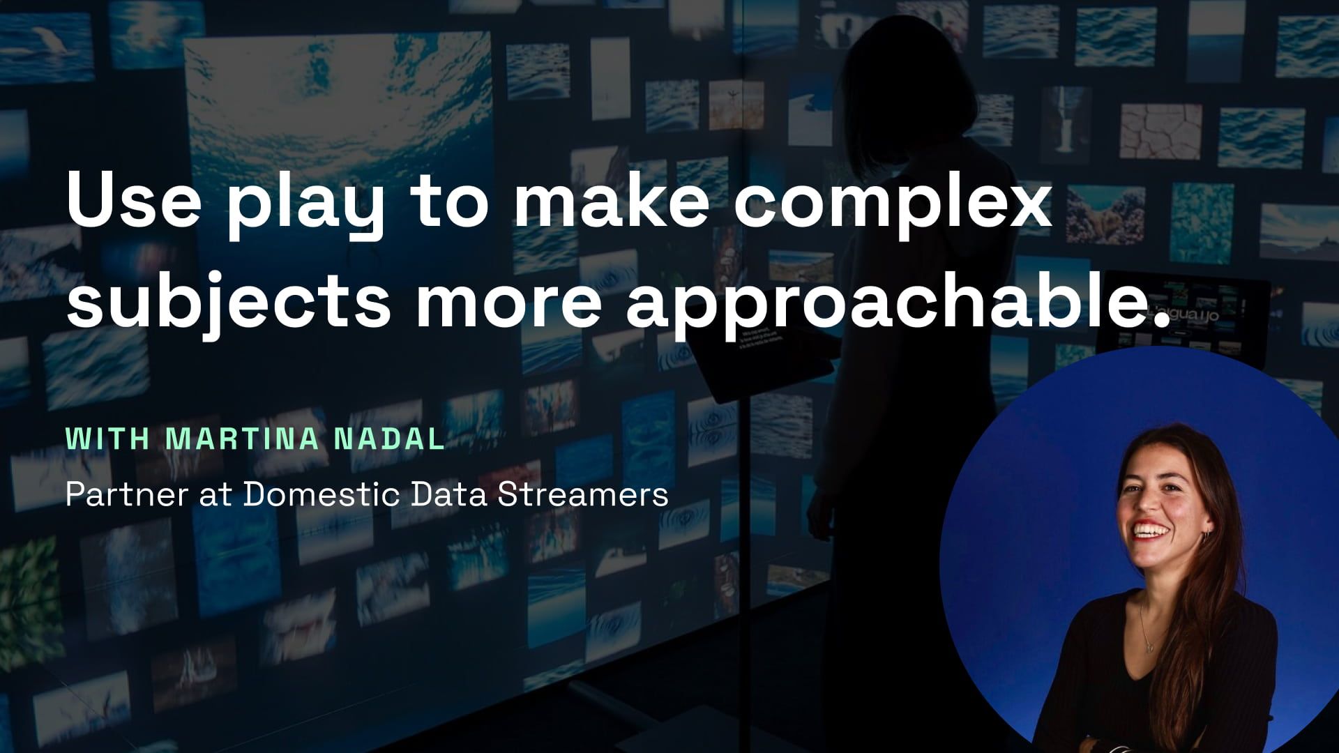
Use play to make complex subjects more a...
In this conversation with Martina Nadal, a partner at Domestic Data Streamers, we delve into the processes behind creating impactf...
5 months

Making “The Pope on the Road,” an AI-Dri...
ATLO created an interactive site presenting the history of the Pope’s apostolic journeys, and the history of the papacy. With a li...
1 years
NightingaleViz
How to
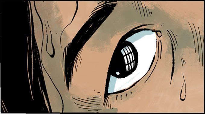
The making of the illustrated investigat...
“Searching for Maura” is part of The Washington Post’s investigative series about the Smithsonian’s collections of human brains an...
1 years
Washington Post
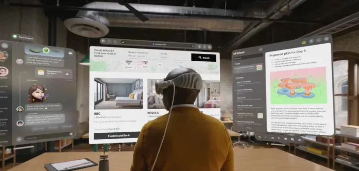
Research
Spatial Journalism - Part I
Research on the implications of Vision Pro for visual storytelling and XR journalism.
1 years