Insights
Learnings and interviews on the making of visual investigations.
How to
Better Data Visualizations with Svelte |...
Learn how to declaratively build responsive, interactive data visualizations with Svelte and D3.
1 years
Research
Sigma Awards: 10 Lessons for Data Journa...
The Sigma Awards celebrate the best in global data journalism. Here, the founders speak about lessons learned from the most recent...
1 years

Interviews
AI, Personalisation and Visual Journalis...
Nic Newman is the editor of the annual Digital News Report. In this conversation we explore the significant impact of visual jour...
5 months
Interviews
Illustration in Journalism
Using illustration in journalism: process, context and tools.
7 months

Interviews
What is Narrative, Anyway?
Interview answers on the definition of narrative.
1 years

Research
Nieman Program On Narrative Journalism
The Nieman Program on Narrative Journalism currently has five major activities: the Nieman Narrative Digest, organizing the 1,000-...
1 years
How to
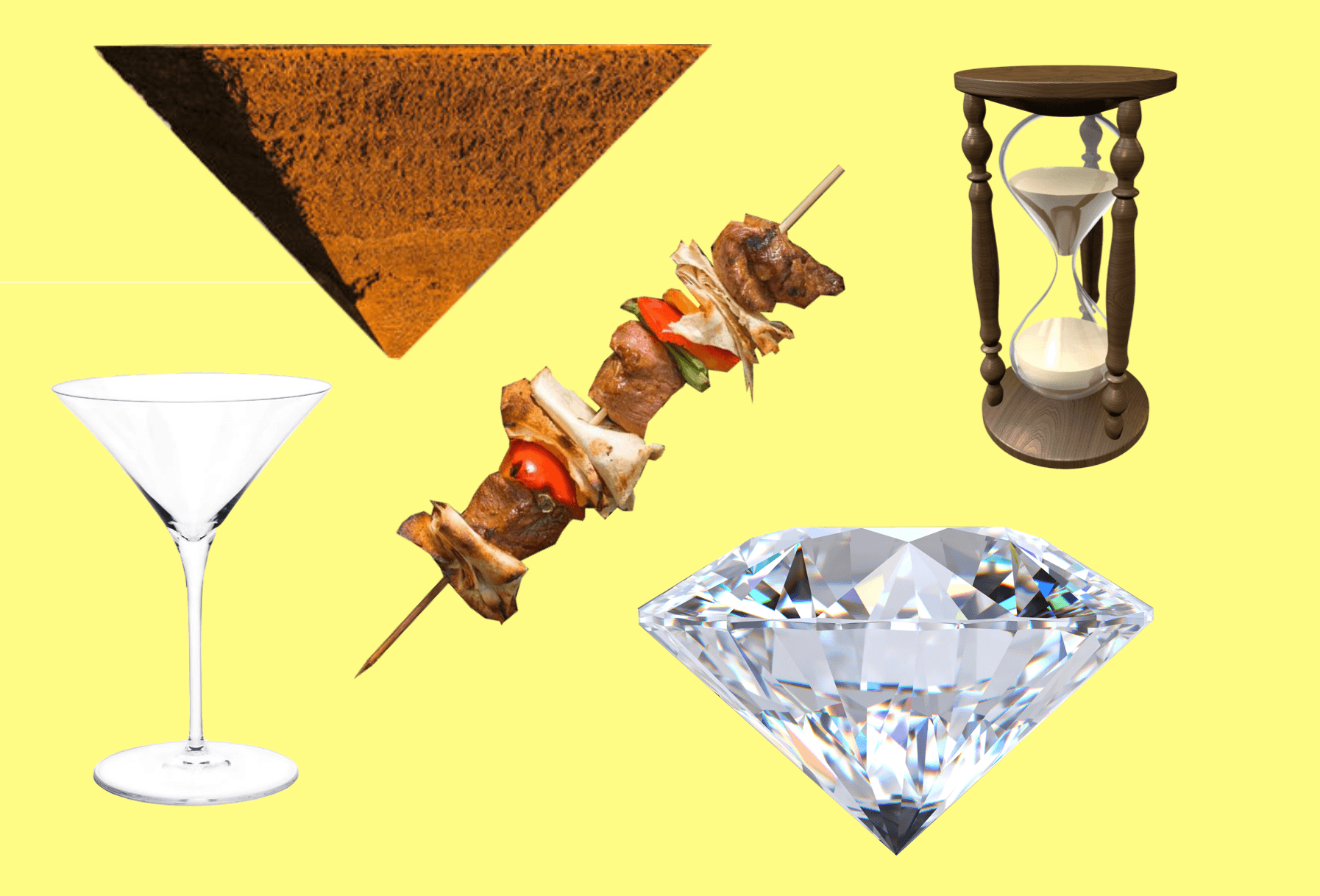
Structuring visual narratives to feed th...
Martinis, pyramids and hourglasses for storytelling.
1 years
Research
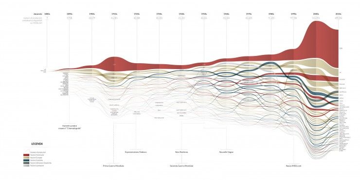
Density Design Lab
DensityDesign is a research lab at the Design Department in Politecnico di Milano, Italy. Our research revolves around information...
1 years
How to
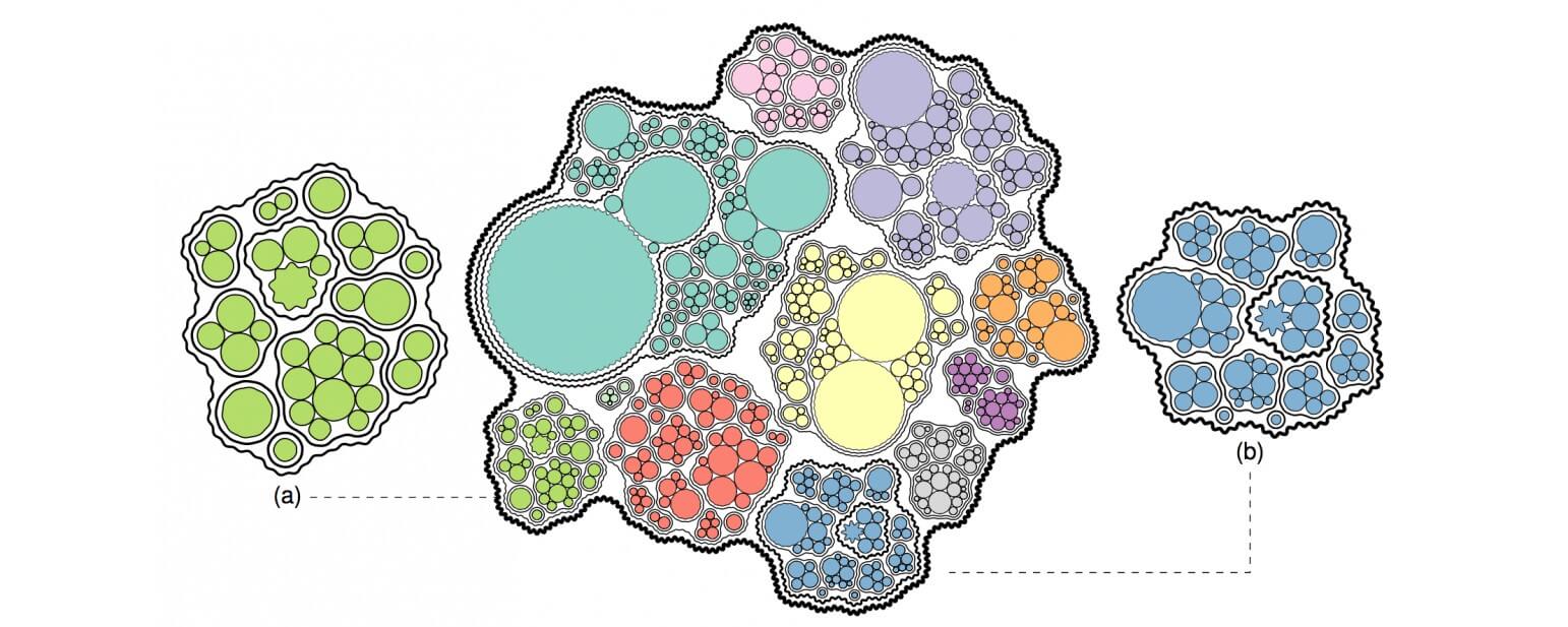
On Graphonyms: the Importance of Chart T...
Chart vocabulary.
1 years
Interviews
Storydoing and storytelling
Understanding context and audience to balance linear and interactive storytelling.
7 months
How to
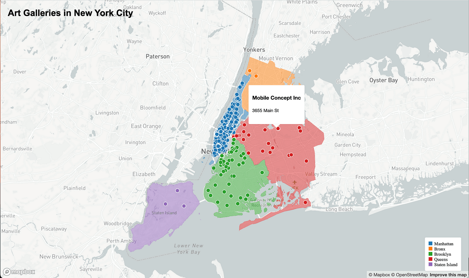
Making a Data Visualization With No Codi...
An exercise in building a data visualization with ChatGPT writing—and debugging!—the code
1 years
Interviews
Behind the Scenes at The Pudding: Creati...
An inside look at the creative processes for interactive storytelling at the Pudding.
7 months
Research
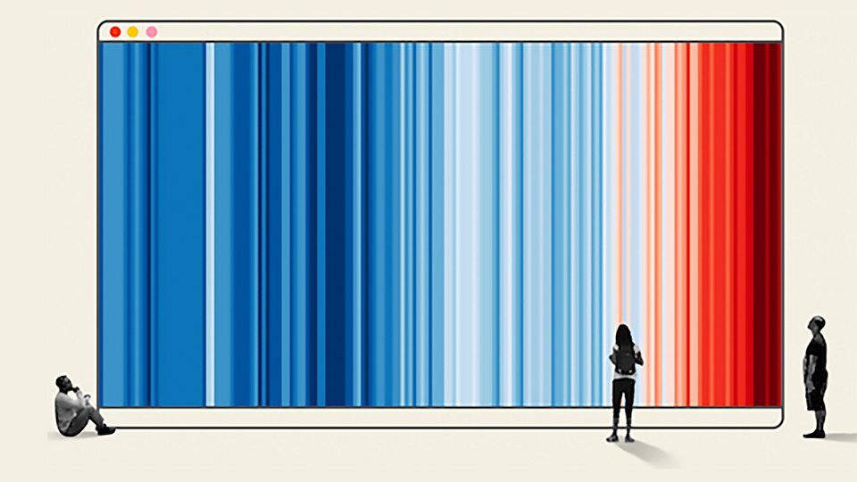
Five charts that changed the world - BBC...
Data visualisation helps us to understand the world. It also has the power to change it. Narrated by Adam Rutherford.
1 years
BBC

How to
Six Principles for Designing Any Chart
An introduction to Google’s new data visualization guidelines
1 years
How to
Where's Larry? bringing data to life thr...
Tapestry 2017 Short Story Presentation #3 by Cole Nussbaumer Knaflic
1 years

How to
Once Upon a Time: From Data to Stories
The word “stories” has become synonymous with visualizing and presenting data. But contrar...
5 months
How to
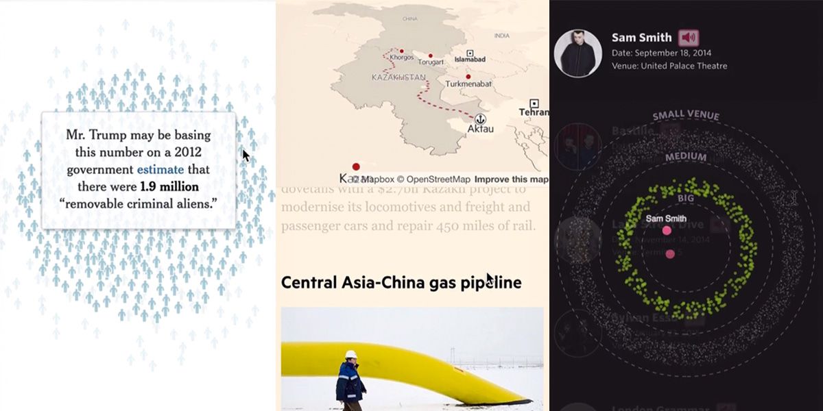
Responsive scrollytelling best practices
How to plan or adapt a scrollytelling story for mobile.
1 years
Interviews
Identifying Visual Potential
We discuss Marco's approach to producing impactful and unique visual stories as well as his definition of success.
7 months
Research
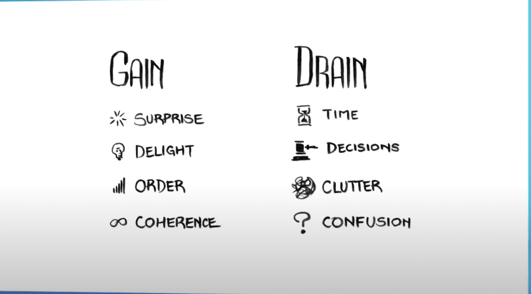
Animation, Pacing, and Exposition
When depicting complex systems, it is not enough for our visualizations to be only beautiful and comprehensive. A good exposition ...
1 years

Interviews
Data Stories - Interview of Pei Ying Loh
Our interview with Pei Ying, Head and co-founder of Kontinentalist, about their processes and creative approach.
7 months
Research
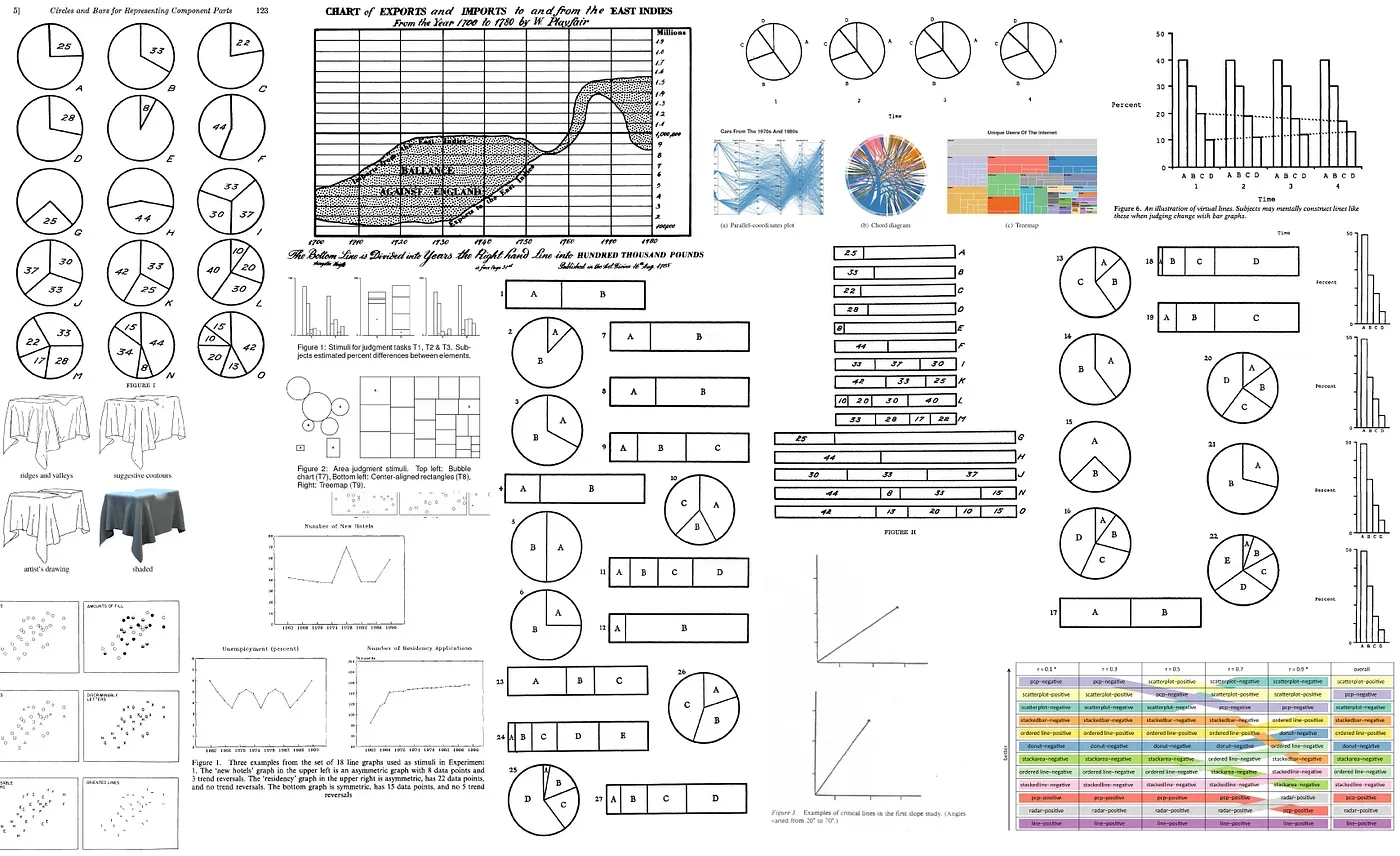
39 studies about human perception in 30 ...
An extreme distillation of many studies done over graphical perception.
1 years
Kennedy Elliot
Research
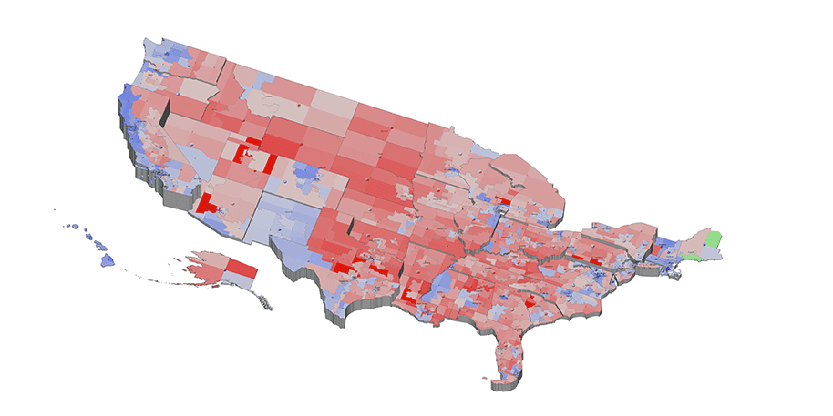
Perception in Visualization
Human perception plays an important role in the area of visualization. An understanding of perception can significantly improve bo...
1 years
North Carolina State University
How to
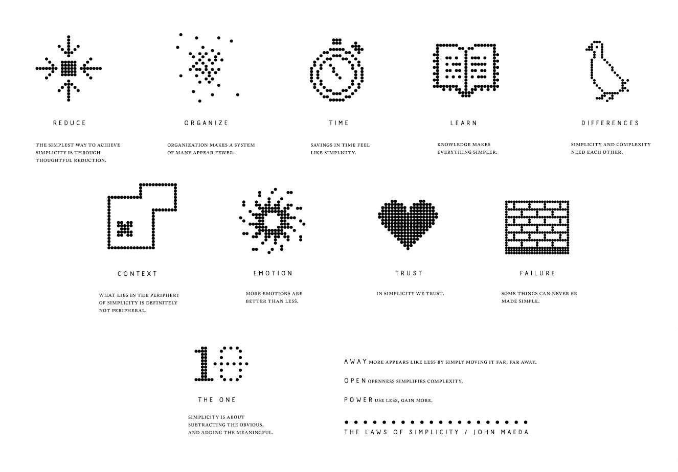
Laws of Simplicity
The Laws of Simplicity is a 100-page book I wrote just as the Apple iPod was starting to take off and while I was earning my MBA a...
1 years
John Maeda

Interviews
Pablo Robles: Immersive Visual Reporting
In this interview with Pablo, a visual journalist at the New York Times, we discuss the importance of physical immersion to gather...
7 months